
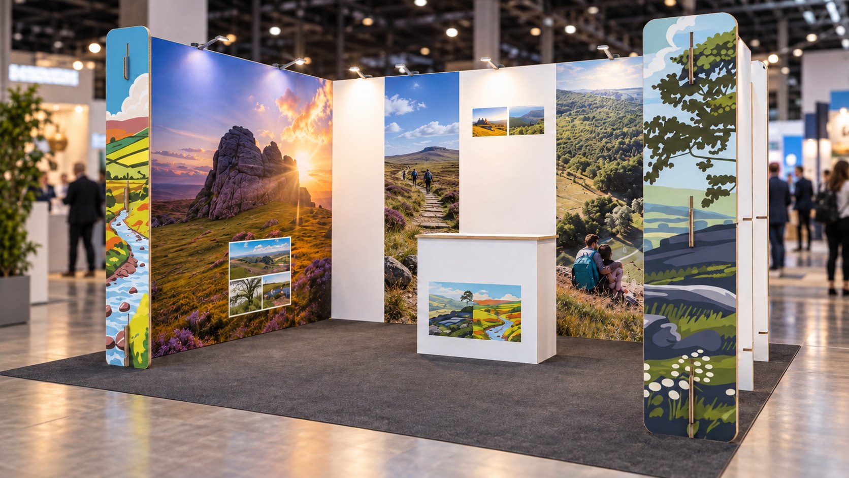
Sustainable Exhibition Stand Design: How to Make an Eco Stand Look Outstanding
Quick answer: Sustainable exhibition stand design works on the same principles as any good stand design: one clear focal point, a bold and restrained layout, strong vertical presence, high contrast graphics readable at four metres, and lighting used deliberately rather than evenly. The constraint that sustainable materials impose is not aesthetic, it is structural. Engineered cardboard spans up to 3 metres unsupported and takes any print finish that MDF takes, so the design vocabulary is effectively unchanged. What changes is that you design for flat pack assembly and single piece graphics rather than for permanence.
Sustainable stands carry a reputation problem. The assumption is that choosing recyclable materials means accepting a stand that looks worthy, brown and slightly apologetic. That assumption was fair around 2015. It is not fair now, and the brands winning best stand awards with cardboard builds are proof of it.
This article is about design specifically: layout, focal points, graphics, colour, lighting and visitor flow. It is not about which material to choose, which is covered properly in our guide to the best materials for sustainable exhibition stands, or about what a stand costs, which is covered in the eco-friendly exhibition stands buyer’s guide.
The Real Constraint Is Structural, Not Aesthetic
It is worth being precise about what sustainable materials actually limit, because most designers over-estimate it.
Design element | Possible in engineered cardboard? | Note |
|---|---|---|
Full colour photographic graphics | Yes | Direct print or applied, quality equivalent to MDF |
Painted finishes | Yes | Specify low VOC water based paint |
Lamination, foiling, spot finishes | Yes | Same techniques as conventional substrates |
Curved and organic forms | Yes | Cardboard is often easier to curve than sheet timber |
Cut-through and layered depth | Yes | CNC routing gives precise shadow and relief effects |
Walls up to 3m unsupported | Yes | Above 3m needs bracing or a support structure |
Shelving and counters | Yes, to about 50 kg per panel | Heavier loads need FSC plywood inserts |
Large hanging or rigged elements | No, not in cardboard alone | Needs a rigged structure, usually a venue contractor |
Real wood veneer or brushed metal finish | Not authentically | Printed simulation only, or use the real material |
Only the bottom two rows are genuine design constraints. Everything above them is available, which means the vocabulary of stand design is essentially intact.
Eight Design Principles
1. One focal point, not five
A visitor walking an aisle gives your stand roughly three seconds of peripheral attention. In that window they can process one idea. Stands fail far more often from competing messages than from weak ones. Decide what the single focal point is, give it the best sightline, and subordinate everything else to it.
2. Build height before you build width
In a busy hall, anything below about 1.8m is hidden behind people. Vertical elements are what carry your brand down the aisle. Check the height limit for your specific hall and stand type first, then use as much of it as the design allows. This is where cardboard has a quiet advantage: low weight means tall elements rarely create floor loading or stability problems that would need engineering sign off.
3. Design the negative space deliberately
The instinct on a small stand is to fill it. Resist it. Empty wall is what makes a focal point read as a focal point, and an over-filled 3m x 3m stand looks smaller than a restrained one of the same size. Restraint also has a material dividend: less board, lower cost, lower footprint.
4. Use contrast rather than brightness
Exhibition halls are visually loud, and every stand is shouting. Turning your volume up rarely wins. What reads at distance is contrast: dark against light, dense against empty, matte against gloss. A predominantly dark stand in a hall of white shell scheme is far more visible than another bright one.
One practical note specific to cardboard. Leaving the natural kraft surface exposed is a legitimate design choice and signals the material honestly, but do not default to it across the whole stand. Natural kraft against a fully printed accent panel is striking. An entirely brown stand is the cliché people expect, and it is worth actively avoiding.
5. Light deliberately, not evenly
Even lighting produces a flat stand. Directional LED that picks out the focal point, grazes a textured surface or backlights a cut-through creates depth. LED draws roughly 85% less power than the halogen it replaced, runs cool, and lasts long enough to travel show to show, so the sustainable choice and the dramatic choice are the same choice here. See lighting solutions for eco-friendly exhibition stands for the specification detail.
6. Design the visitor route, not just the elevation
Stands get designed as elevations and experienced as spaces. Work out where a visitor enters, what stops them, where a conversation happens and where they leave. An open corner draws people in. A counter across the front pushes them away. Where you place your focal point relative to the approach direction matters more than its size.
7. Give people a reason to stop moving
Visual impact gets attention. Something to do converts it into dwell time. A demonstration, a screen, a physical object worth handling, or a genuinely useful takeaway holds people long enough for a conversation. Our guide to using 3D creative objects to boost dwell time covers this properly.
8. Design for the build, not just the render
A design that cannot be built inside the get-in window is not a good design. Flat pack cardboard assembles in three to four hours for a 3m x 3m stand without tools, which gives you creative freedom precisely because it removes build risk. Design in panel sizes that fit the access route, and check lift dimensions if you are not on the ground floor.
Eco-Friendly Exhibition Graphics
Graphics carry most of the visual load on any stand, and they are also where the largest and most avoidable environmental cost sits. Most exhibition graphics are still printed on PVC banner, which is effectively non-recyclable in the UK and contains chlorine based plasticisers.
Graphic type | Recyclable in UK | Reuse cycles | Best for |
|---|---|---|---|
Direct print to cardboard | Yes, paper stream | 1 to 3 | Full stand walls, single use builds |
Dye sublimation on recyclable polyester | Yes, via supplier scheme | 5 to 10 | Tension fabric walls reused show to show |
FSC paper laminated with PE | Yes | 1 | Posters, pull-ups, literature |
PVC banner | No | Several, but unrecyclable at end | Avoid |
Self adhesive vinyl on foamex | No | 1 | Avoid |
Four rules for graphics that work at exhibition distance:
- Readable at four metres. Headline type needs to work from across an aisle. If it only reads at one metre, it is literature rather than a graphic.
- Fewer words than feels comfortable. Six words on a wall beats thirty. The thirty word version is what your team says out loud.
- Print direct where you can. Printing straight to the cardboard surface removes a substrate layer, reduces cost and waste, and avoids the slight lift and bubbling you get with applied vinyl.
- Keep dated content on replaceable panels. Put anything with a year, a price or a campaign line on a separate panel so the rest of the stand survives the next refresh.
Choosing a Layout Format
The number of open sides changes the design problem more than the floor area does, and it also changes the price.
Format | Design priority | 3m x 3m price (ex VAT) |
|---|---|---|
In-line, 1 open side | Back wall does all the work. Build a single strong elevation. | £2,587.20 |
Corner, 2 open sides | Design the corner itself as the focal point, not the two walls separately. | £1,747.20 |
Peninsula, 3 open sides | Needs a strong central vertical readable from every approach. | £907.20 (3m wide) |
The counterintuitive point is that more open sides costs less, because there is less wall to build. It also makes the design harder, because there is no back wall to carry the message and everything has to work in the round.
Five Design Mistakes Specific to Sustainable Stands
- Making sustainability the message. Unless you are selling sustainability, your stand should sell what you sell. Let the material do the signalling and use the graphics for your actual proposition.
- The all-brown stand. Exposed kraft is a good accent and a poor whole-stand strategy. It is exactly what people expect from an eco stand, which makes it invisible.
- Adding real plants without a plan. Greenery works visually, but living plants need water, survive badly in halls, and frequently get binned afterwards, which undercuts the point. Hire them and return them, or leave them out.
- Ignoring the height limit until the design is finished. Height is the most valuable thing you have in a crowded hall and the most commonly capped. Confirm it before you design, not after.
- Designing a stand that cannot be built in the window. Check the get-in time and the access route before committing to a design that assumes a full build day.
Frequently Asked Questions
Next Steps
Send us your footprint, the number of open sides, the venue and your height limit, and we will come back within one working day with a design direction and a fixed booth supply price. Request a design brief from EcoStands Green.
- Gallery: see completed cardboard stand builds
- Bespoke and Custom Built Ecostands: fully custom design and build
- Eco Space Only Packages: turnkey builds for space only footprints
- Eco Shell Scheme Packages: fixed price graphics for shell scheme spaces
For bespoke FSC timber or recycled aluminium designs, our parent company Expositionists delivers those projects across the UK and Europe.
Related Reading
- The Best Materials for Sustainable Exhibition Stands: 2026 Buyer’s Guide
- Eco-Friendly Exhibition Stands: The 2026 Buyer’s Guide
- Cardboard Exhibition Stands Explained: Strength, Cost and Sustainability
- Lighting Solutions for Eco-Friendly Exhibition Stands
- Sustainable Exhibition Stands for UK Venues
- Reusable vs Recyclable vs Refurbishable: An Exhibitor’s Decision Tree